- Create the modal component you wish to load
- Let the onClick event of your button point to a function, say paymentHandler
- Import this model to where you want to load it
- Import the useState hook
- Set it to false
- Destructure it to have paid variable and setPaid function
- In the paymentHandler function, set the setPaid function to true
- Below the button with this event, output a dynamic expression there where if paid variable is true, then load the modal component or if false, null.
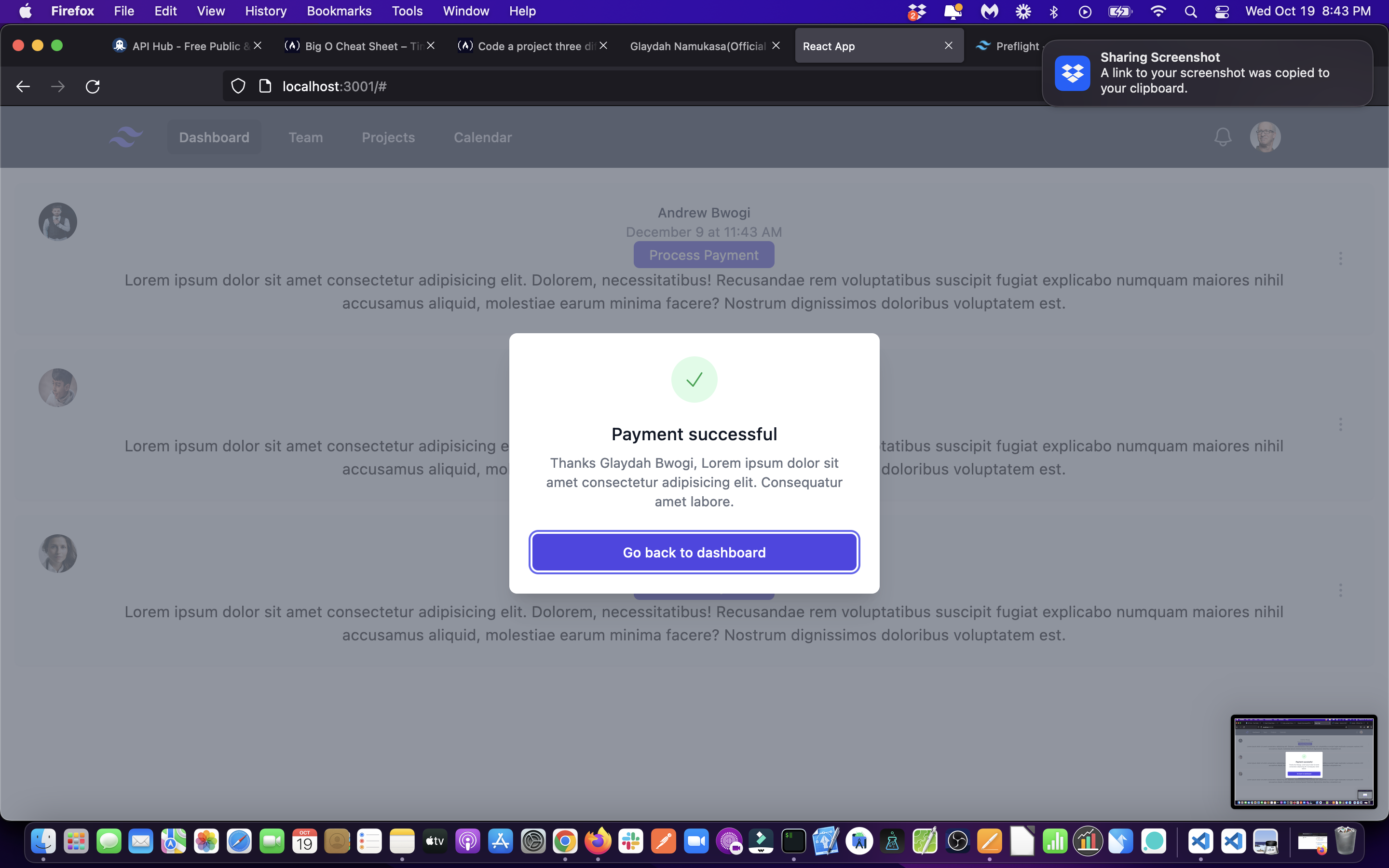
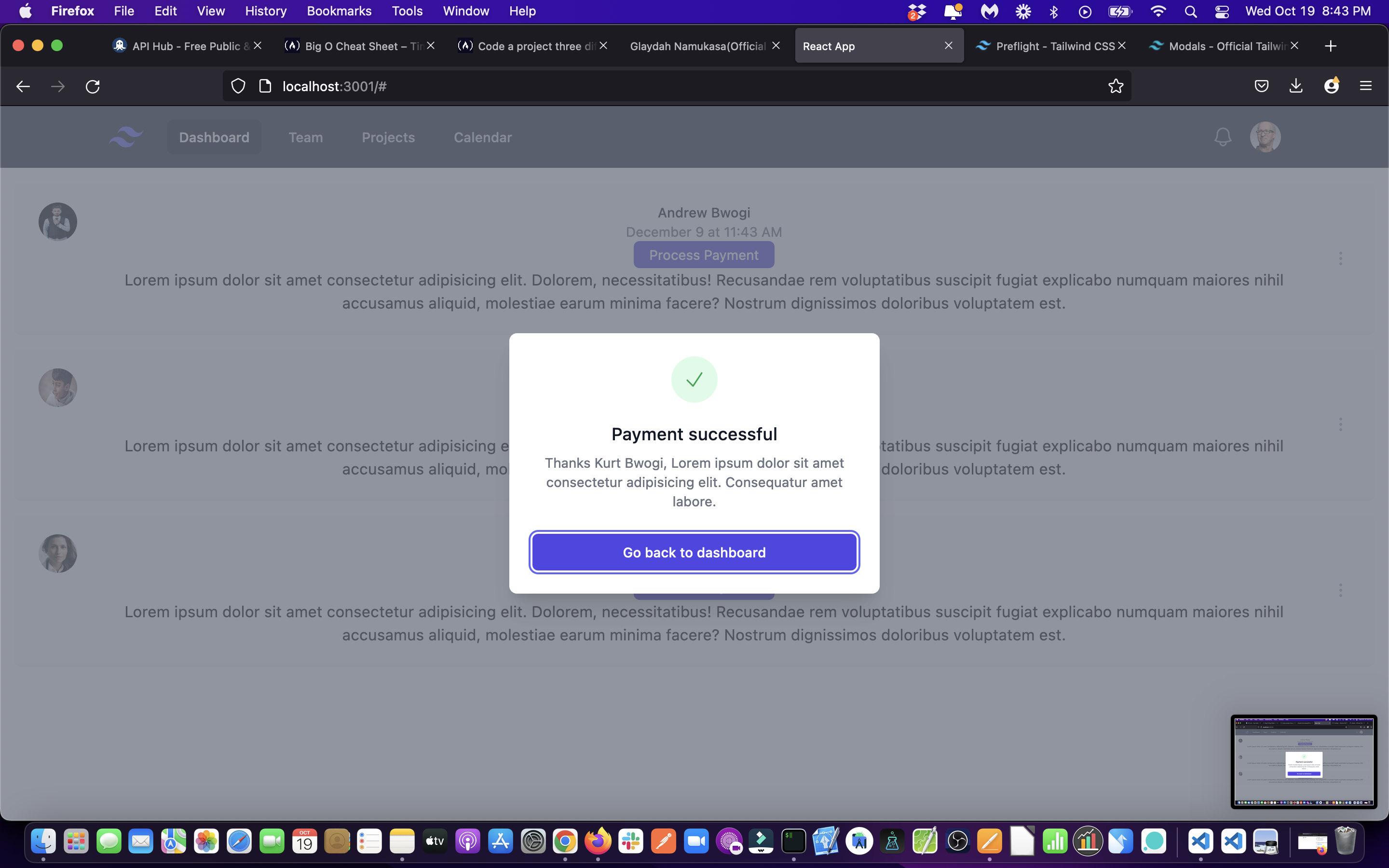
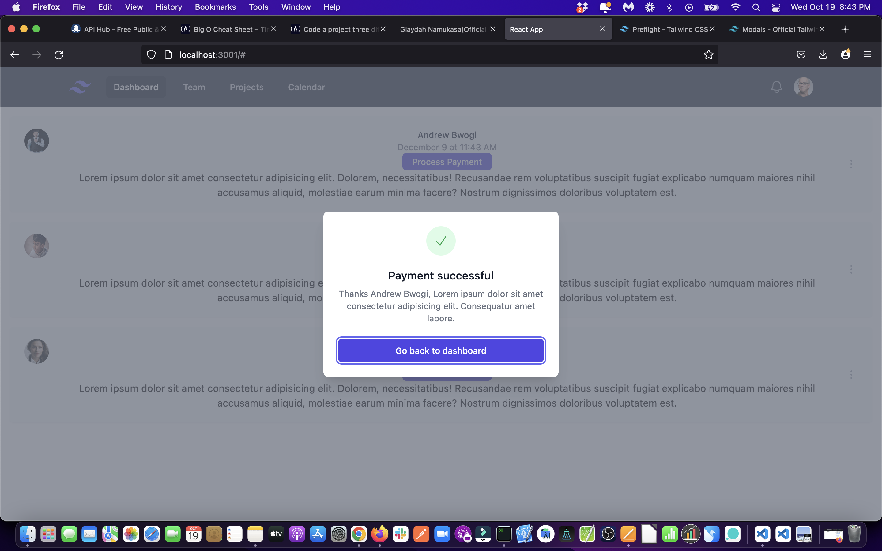
Models in action repo on my Github account, where all this code can be found.
import { Fragment, useState } from 'react';
import { Dialog, Transition } from '@headlessui/react';
import { CheckIcon } from '@heroicons/react/24/outline';

export default function ModalSuccess(props) {
	const [open, setOpen] = useState(true);

	return (
		<Transition.Root show={open} as={Fragment}>
			<Dialog as='div' className='relative z-10' onClose={setOpen}>
				<Transition.Child
					as={Fragment}
					enter='ease-out duration-300'
					enterFrom='opacity-0'
					enterTo='opacity-100'
					leave='ease-in duration-200'
					leaveFrom='opacity-100'
					leaveTo='opacity-0'
				>
					<div className='fixed inset-0 bg-gray-500 bg-opacity-75 transition-opacity' />
				</Transition.Child>

				<div className='fixed inset-0 z-10 overflow-y-auto'>
					<div className='flex min-h-full items-end justify-center p-4 text-center sm:items-center sm:p-0'>
						<Transition.Child
							as={Fragment}
							enter='ease-out duration-300'
							enterFrom='opacity-0 translate-y-4 sm:translate-y-0 sm:scale-95'
							enterTo='opacity-100 translate-y-0 sm:scale-100'
							leave='ease-in duration-200'
							leaveFrom='opacity-100 translate-y-0 sm:scale-100'
							leaveTo='opacity-0 translate-y-4 sm:translate-y-0 sm:scale-95'
						>
							<Dialog.Panel className='relative transform overflow-hidden rounded-lg bg-white px-4 pt-5 pb-4 text-left shadow-xl transition-all sm:my-8 sm:w-full sm:max-w-sm sm:p-6'>
								<div>
									<div className='mx-auto flex h-12 w-12 items-center justify-center rounded-full bg-green-100'>
										<CheckIcon
											className='h-6 w-6 text-green-600'
											aria-hidden='true'
										/>
									</div>
									<div className='mt-3 text-center sm:mt-5'>
										<Dialog.Title
											as='h3'
											className='text-lg font-medium leading-6 text-gray-900'
										>
											Payment successful
										</Dialog.Title>
										<div className='mt-2'>
											<p className='text-sm text-gray-500'>
												Thanks {props.name}, Lorem ipsum dolor sit amet
												consectetur adipisicing elit. Consequatur amet labore.
											</p>
										</div>
									</div>
								</div>
								<div className='mt-5 sm:mt-6'>
									<button
										type='button'
										className='inline-flex w-full justify-center rounded-md border border-transparent bg-indigo-600 px-4 py-2 text-base font-medium text-white shadow-sm hover:bg-indigo-700 focus:outline-none focus:ring-2 focus:ring-indigo-500 focus:ring-offset-2 sm:text-sm'
										onClick={() => setOpen(false)}
									>
										Go back to dashboard
									</button>
								</div>
							</Dialog.Panel>
						</Transition.Child>
					</div>
				</div>
			</Dialog>
		</Transition.Root>
	);
}<button onClick={paymentHandler}> Process Payment</button>import ModalSuccess from './ModalSuccess';import React, {useState } from 'react';useState(false)const [paid, setPaid] = useState(false);const paymentHandler = () => {
setPaid(true);
};And finally, below the button with this event, output a dynamic expression there where if paid variable is true, then load the modal component or if false, null.
<button onClick={paymentHandler}> Process Payment </button>
// {paid ? <ModalSuccess /> : null}
// instead of the above ternary operator, use the double ampersand like below
{paid && <ModalSuccess name={props.name} />}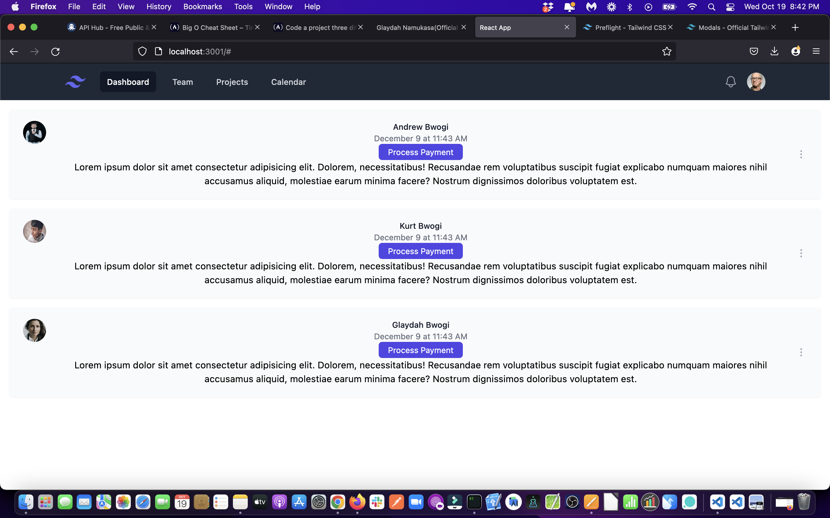
Leave a comment if you need to understand anything else. Thanks.