- style guide + code snippets = DESIGN SYSTEM 💖
Put simply:
- css + js snippets
- guide for developers with no taste


Big step for Sass
- Less is in Js (@ - syntax)
- Sass was in Ruby (this year they switch to Js as well) ($ - syntax, scss)
@primary-color: seashell;
@primary-bg: darkslategrey;

body {
  color: @primary-color;
  background: @primary-bg;
}
$primary-color: seashell;
$primary-bg: darkslategrey;

body {
  color: $primary-color;

  background: $primary-bg;

}
body {
  color:seashell;
  background: darkslategrey;
}

- Bootstrap 3.x - float-based style (always problems with clearfix)
- Bootstrap 4.x - flexbox grid by default^
^fully supported by IE10+ & Edge
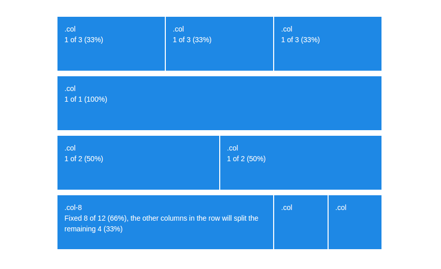
Means:
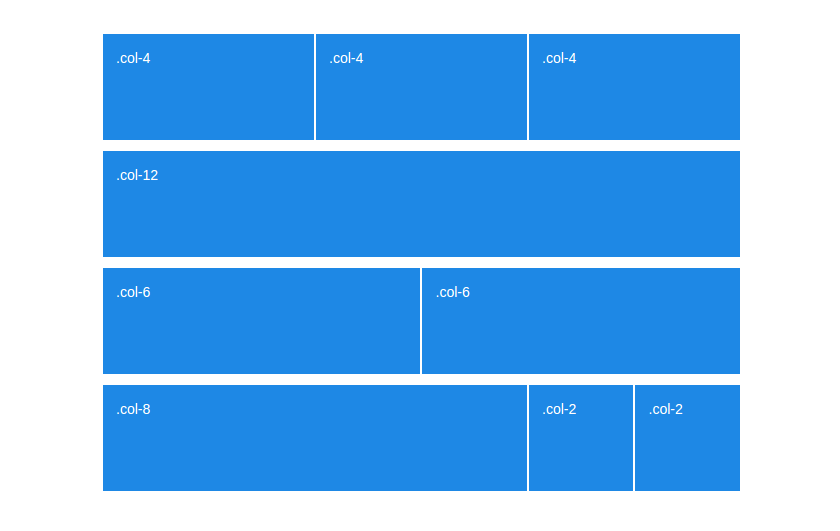
- auto-layout columns ANY number of columns
- combined with 12-col grid known from previous version
- more control of both height and width
<div class="row">
   <div class="col-xs-2">.col-xs-2</div>
   <div class="col-xs-4">.col-xs-4</div>
   <div class="col-xs-6">.col-xs-6</div>
</div>
<div class="row">
   <div class="col-2">.col-2</div>
   <div class="col-4">.col-4</div>
   <div class="col-6">.col-6</div>
</div>
Goodbye offset, hello justify-content!
<div class="row">
    <div class="col-xs-6 col-xs-offset-3">This column is now centered.</div>
</div>
<div class="row justify-content-center">
    <div class="col-6">All columns in that row will be automatically centered.</div>
</div>
But: If you didn’t know how to use flexbox, it's high time to learn!
e.g. with flexbox cards here: https://codepen.io/ritawanderlust/pen/KejyOE
- REMs are a way of setting font-sizes based on the font-size of the root HTML element.
- They also allow you to quickly scale an entire project by changing the root font-size (for example at a certain media query/screen size)

pls, forget about: just use pixels - easy to make accessibility faux pas

We now have xs, sm, md, lg, and xl.
- Extra small (xs) - below 576px
- Small (sm) - between 576px and 768px
- Medium (md) - between 768px and 992px
- Large (lg) - between 992px and 1200px
- Extra Large (xl) - over 1200px (4k ready)
This also means every tier has been bumped up one level
(so .col-md-6 in v3 is now .col-lg-6 in v4).
Documentation Utilities (borders, paddings, responsive floats, clearfix...) Variables customizing like:
- Colors
- Options (Flex Box, transitions, rounded, shadows, etc.)
- Spacing
- Body (defaults)
- Link Styles
- Grid Breakpoints
- Grid Containers
- Grid Columns
- Typography
- Components
- Tables
Overwritting Bootstrap caused many mistakes and bad practices.
Bootstrap 4 proposes us "sassy" style guide / modular changes instead overwritting ;)
- file reboot added
- removed custom builder - modular sass structure (
_utilities.scss,_variables.css,_reboot.scssetc..) - removed glyphicons (you decide what to use: Glyphicons/FontAwesome/Iconic/Octicons)
- cards instead of pannels